
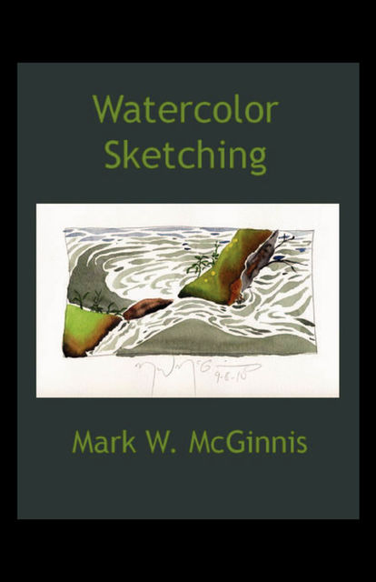
Watercolor Sketching
- Julia Vishnevskayaalıntı yaptı7 yıl önce
 I believe the negative space should be equally as interesting as the positive space (the subject).
 - Олегalıntı yaptı8 yıl önce
 Color terms may be helpful when talking about color. The first is local color. This is the basic color of a subject – we might say a banana’s local color is yellow. A second type of color is optical color. This type of color refers to when the artist tries to capture the true complexity of the light reflecting off the surface of an object. The banana may be yellow but on close observation we may see areas that are still green and yellow green. Closer inspection will show there are brown and black markings and some of the yellow seems to have bit more orange in it, and there are shadows on the surface caused by the light source. The color of the surface the banana is sitting on is being reflected on the surface of the fruit creating more color variation. This is the optical color of the subject.
 - Олегalıntı yaptı8 yıl önceYou need to ask yourself, “Are those negative spaces interesting?”
- Олегalıntı yaptı8 yıl öncecommon mistake with beginning students is to place their subject, be it a flower or a person, more or less floating in the middle of the space. I call this object-oriented space. The student is focusing on the subject at the expense of composition.
- Олегalıntı yaptı8 yıl önceSpace is not an optional element. It is always a part of your sketch
- Олегalıntı yaptı8 yıl önceWhen I begin a sketch I look at my subject and determine what shape would best suit my subject – a rectangle with the proportion of the paper, a square, a longer rectangle, a circle, an arched shape, and so on. When I have decided, I take a 2B pencil and freehand the shape on the 9” X 12” leaving a border of white paper.
- Олегalıntı yaptı8 yıl öncetree may be lovely but you need not try to paint every leaf on it. Decide which shapes are the most interesting and which will help you create interesting negative shapes in your composition. You may wish to work with the intricacies of the natural shapes you are viewing or you may wish to abstract and simplify. It is a matter of style.
- Олегalıntı yaptı8 yıl önceAnother aspect is the shape of the subject matter you are dealing with. The shape can be natural, to man-made, to abstract.
- Олегalıntı yaptı8 yıl önceBut, in most cases a few accents of dark value bring balance and interest to the composition
- Олегalıntı yaptı8 yıl önceMost people are inclined to want to begin with a pencil sketch. I personally find the pencil sketch confining and I like to begin directly with watercolor, developing my shapes with the brush. This may seem a bit frightening at first, but with practice it is a feeling of liberation to apply the color directly to the paper.
fb2epub
Dosyalarınızı sürükleyin ve bırakın
(bir kerede en fazla 5 tane)